Menu
Close
Work
About
Services
Insights
work
Filter:
All
Packaging
Identity
Brand Platform
Packaging Design
Just Brutal
Brand Identity
Naming
Guide
Justin Joy
Packaging Design
Naming
Guide
Moon Meadow
Discovery
Naming
Packaging Design Concept
Sad Padre
Brand Identity
Logo
Guide
Where 2 go
Brand Identity
Logo & Packaging Design
3D Renders
The MOOD
Packaging Design
Logo & Packaging Design
SKUs & Print-ready Files
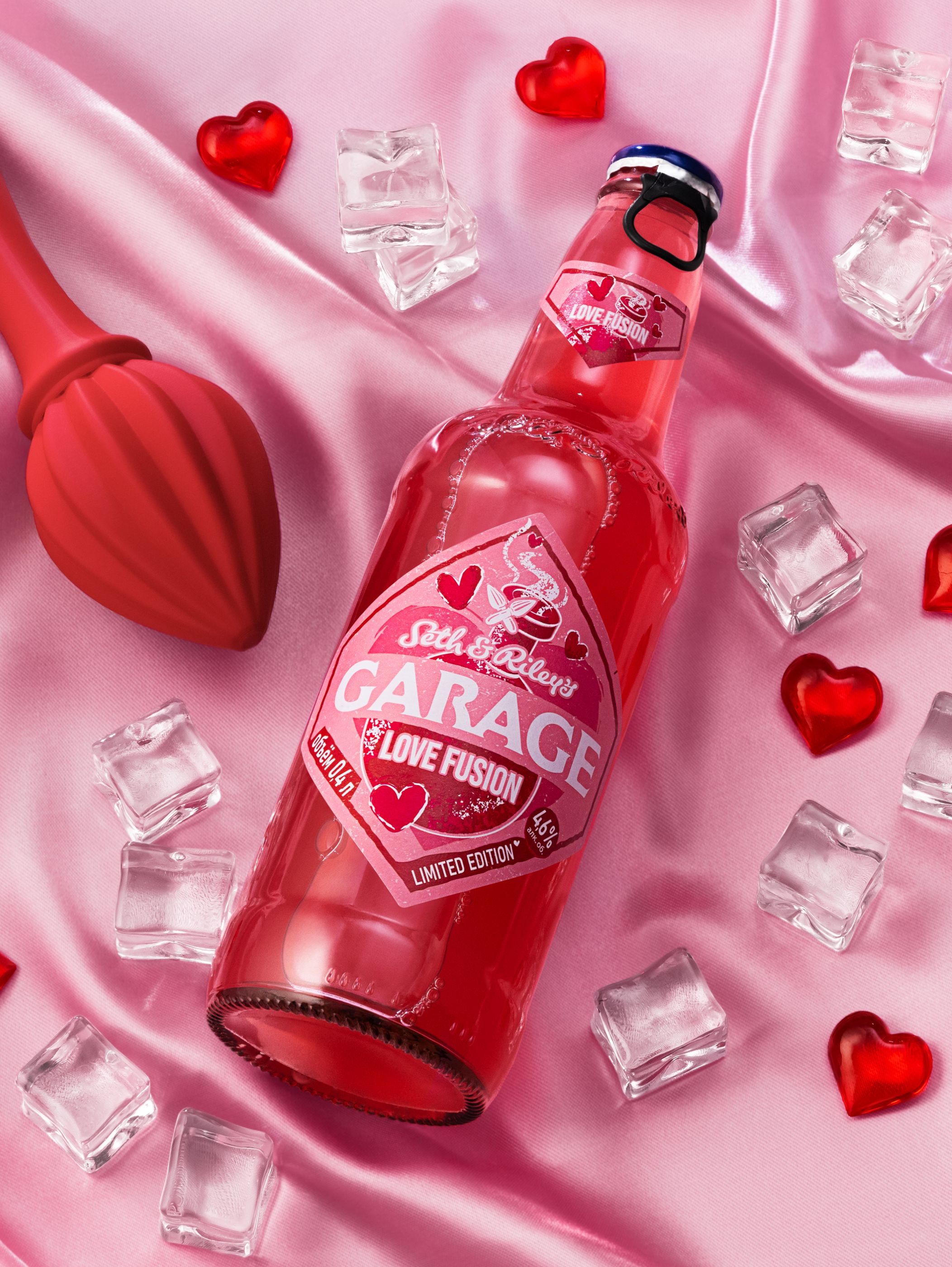
Garage Love Fusion
Packaging Design
Naming
Logo
2:2 Akvavit
Discovery
Website Design
Social Media Playbook
VERO
Brand Identity
Logo
Guide
Binpong
Packaging Design
Logo
Brand Platform
AllYoung
Packaging Design
Zatecky Gus
Brand Identity
Logo
Guide
Jetup
Packaging Design
Naming
Logo
BALI BU
Brand Identity
Logo
Guide
Tradel.Tech
Brand Identity
Naming
Logo
Soul Extracts
Brand Identity
Naming
Logo
Guide
RASKROI
Packaging Design
S&R’s Garage Hard Peach
Brand Identity
Guide
Logo
Tumar Invest
Brand Identity
Logo
Guide
Binar Lab
Packing Design
Logo
DANONE Greek Yogurt
Brand Identity
Logo
Guide
White Square
Packaging Design
Frudoza Ice Cream
Brand Platform
Packaging Design
Markell Cosmetics
Packaging Design
Guide
Alvado
Brand Identity
Naming
Logo
STARLING
Packaging Design
Naming
Logo
2:2 Akvavit
Packaging Design
Logo
Brand Platform
AllYoung
Packaging Design
Zatecky Gus
Packaging Design
Naming
Logo
BALI BU
Packaging Design
S&R’s Garage Hard Peach
Packing Design
Logo
DANONE Greek Yogurt
Brand Platform
Packaging Design
Just Brutal
Packaging Design
Naming
Guide
Moon Meadow
Discovery
Naming
Packaging Design Concept
Sad Padre
Brand Identity
Logo & Packaging Design
3D Renders
The MOOD
Packaging Design
Logo & Packaging Design
SKUs & Print-ready Files
Garage Love Fusion
Packaging Design
Frudoza Ice Cream
Brand Platform
Packaging Design
Markell Cosmetics
Packaging Design
Guide
Alvado
Brand Identity
Logo
Guide
Binpong
Brand Identity
Logo
Guide
Jetup
Brand Identity
Logo
Guide
Tradel.Tech
Brand Identity
Naming
Logo
Soul Extracts
Brand Identity
Naming
Logo
Guide
RASKROI
Brand Identity
Guide
Logo
Tumar Invest
Brand Identity
Logo
Guide
Binar Lab
Brand Identity
Logo
Guide
White Square
Brand Identity
Naming
Guide
Justin Joy
Brand Identity
Logo
Guide
Where 2 go
Discovery
Website Design
Social Media Playbook
VERO
Brand Identity
Naming
Logo
STARLING
SMM Guide
Guide
Brand Identity
Logo
Packaging Design
Product Video
Website Design
Cards & Banners for E-commerce
Social Media Playbook
3D Renders
Packaging & Logo Guide
SKUs & Print-ready Files
Logo & Packaging Design
Naming
Brand Platform
Discovery
We collaborate with ambitious brands and people. Ready for changes?
hello@aidapioneer.com